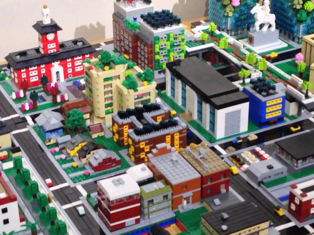
It is fun to build office towers and such, but much of modern cities is much more suburban in its architecture. So many boxy single-story buildings surrounded by parking lots. How about we build something a mundane, a doughnut shop.
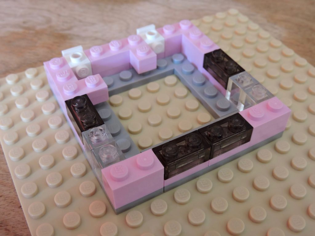
I’m opting for a 8×8 footprint. That scales to 60’x60′ for about 3600 square feet. That should be about right, and it gives me room around the edges for parking spaces and such.
I’m building the walls with 1×2 light purple plate that I got from the Pick-A-Brick wall. 1×1 transparent bricks stand in for the doors and I’m using 1×2 transparent brown plate for the windows. With such light colored walls, I wanted the windows to contrast, thus the darker transparent color. I’ve also tried to use a classic fast food restaurant layout with doors on the opposite walls and windows around the dining area.
At this point the walls are three plates high (9 feet).
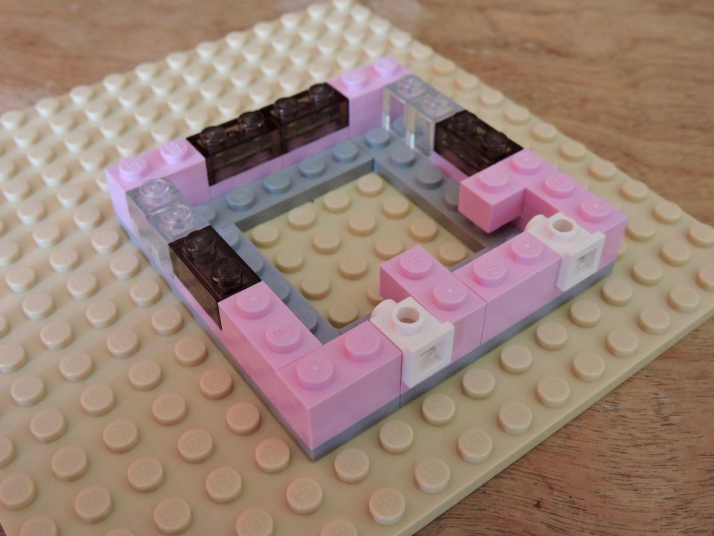
Along the back wall I have used a couple of headlight bricks to make a pair of drive-thru windows.
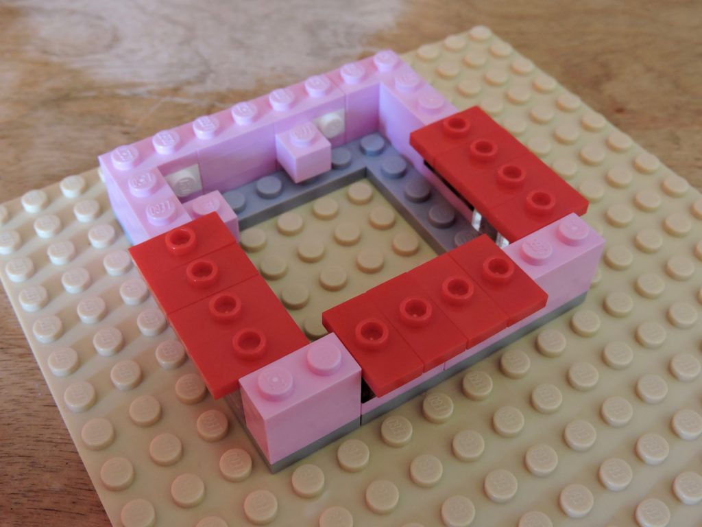
A dozen bright red jumpers make for perfect awnings. My previous window and door placement was all about making sure that I could build the awnings this way without anything running into each other. One last layer of those light purple plates, and I have nice 12 foot walls, just about right for a commercial building with drop ceilings.
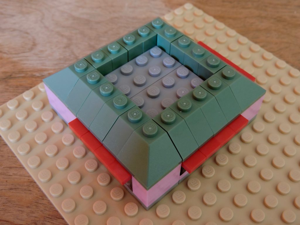
For the roof, my collection yielded up a nice bit of sand green. With the slopes on, the awnings are toned down nicely and the drab color helps that pink (which TLG has helpfully named light purple) really pop.
In the center of the building, I’ve stacked 2×4 medium stone gray bricks two deep. This solid core makes the slopes more stable and gives me a platform for the rest of the items that will go on the roof.
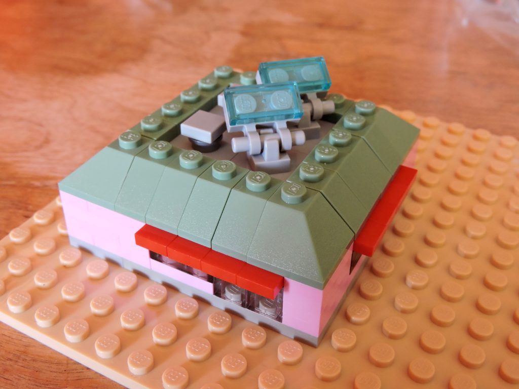
A layer of 2×2 jumpers gives me the perfect spacing for a couple boxy vents and a pair of solar panels. I’ve used similar details on other buildings, as I like having a consistent design language.
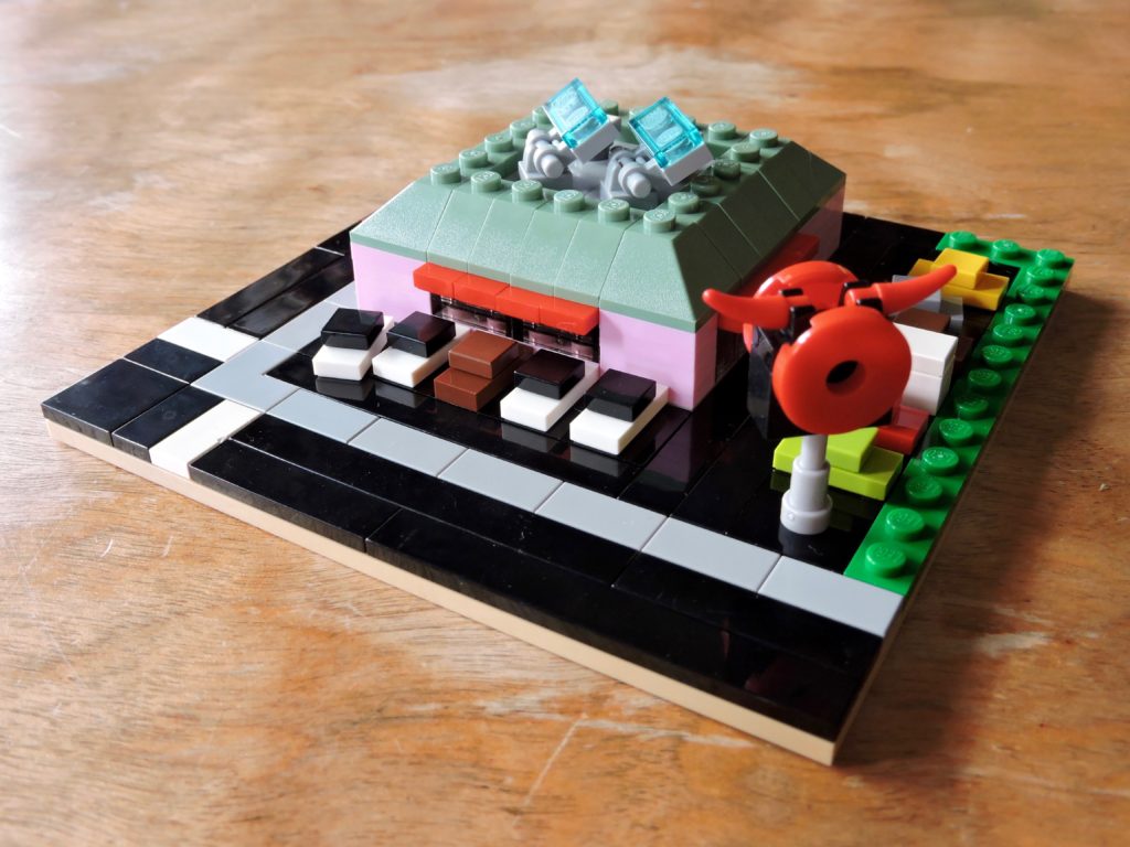
The landscaping really brings this little building into its own. I’ve used jumpers to provide attachment points for cars in the parking lot, alternating 2×2 and 1×2 to create nice half-stud gaps. A bit of grassy median along one side of the lot makes my suburban concession to green space.
I actually built the sign in advance and that helped dictate the color scheme for the building. Micropolis doesn’t lend itself to text, but oversized logos can look great. This red horned doughnut is for Devil’s Doughnuts. I might need to make a couple more, or incorporate them into some other builds in the future.
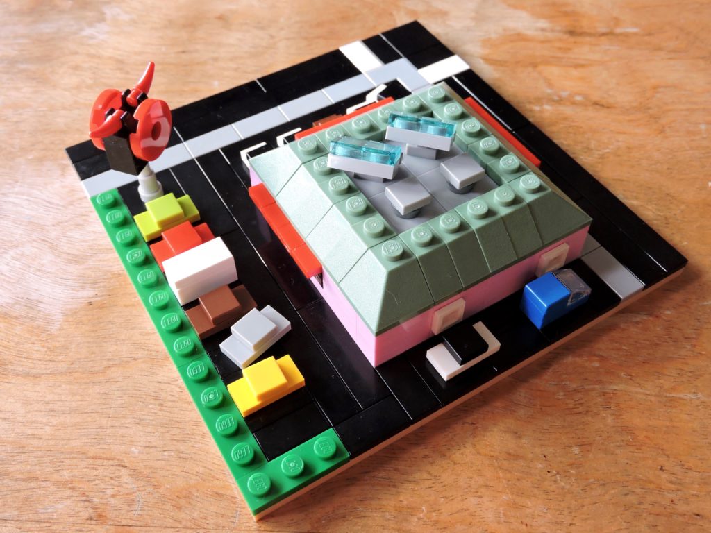
In parting, we’ll take a quick look at the back of shop. I went with the old-school two window set-up for the drive-thru and I think it turned out great.
This was a quick little building, but eateries like this litter the suburban landscape and I’d be remiss if I didn’t have some in my Micropolis.
See you next week!
Keep building and enjoy!