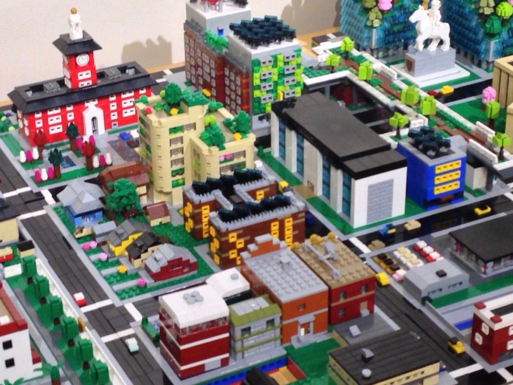
Most big cities are defined by the cluster of office towers at their core. These manifestations of ego create iconic skylines. So far I’ve only focused on fairly modest buildings, now it is time to build something a little taller and flashier.
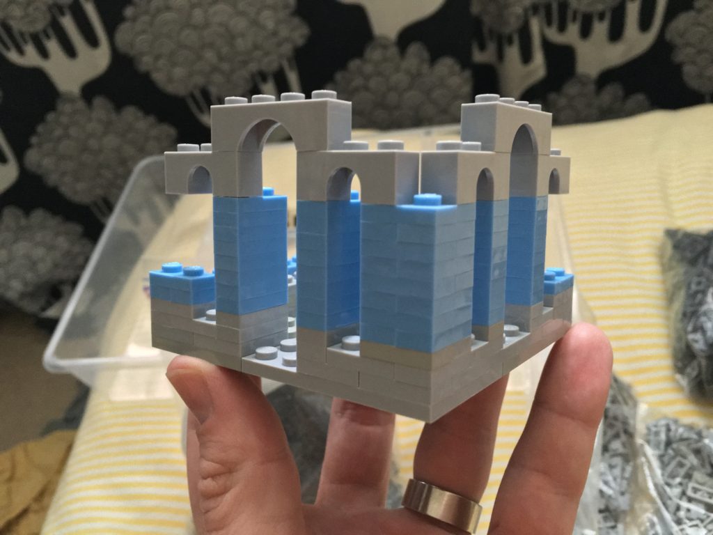
I had an idea in my head, so I started sketching it out in bricks. I wanted this section to be masonry, so I built it with plates. I wanted the building to have drab stone at the bottom and then I used medium blue above that.
What killed this for me is the arches. Using light gray arches was too much, not to mention that I had a limited pallet of elements available in medium blue. I learned a bit and started over.
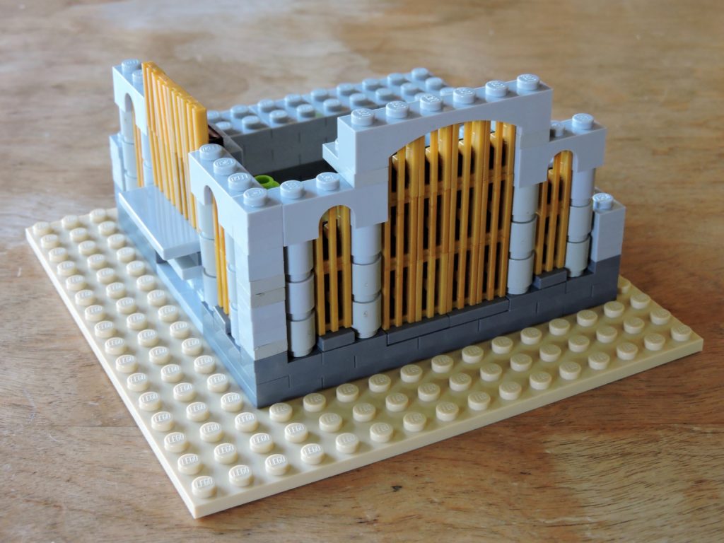
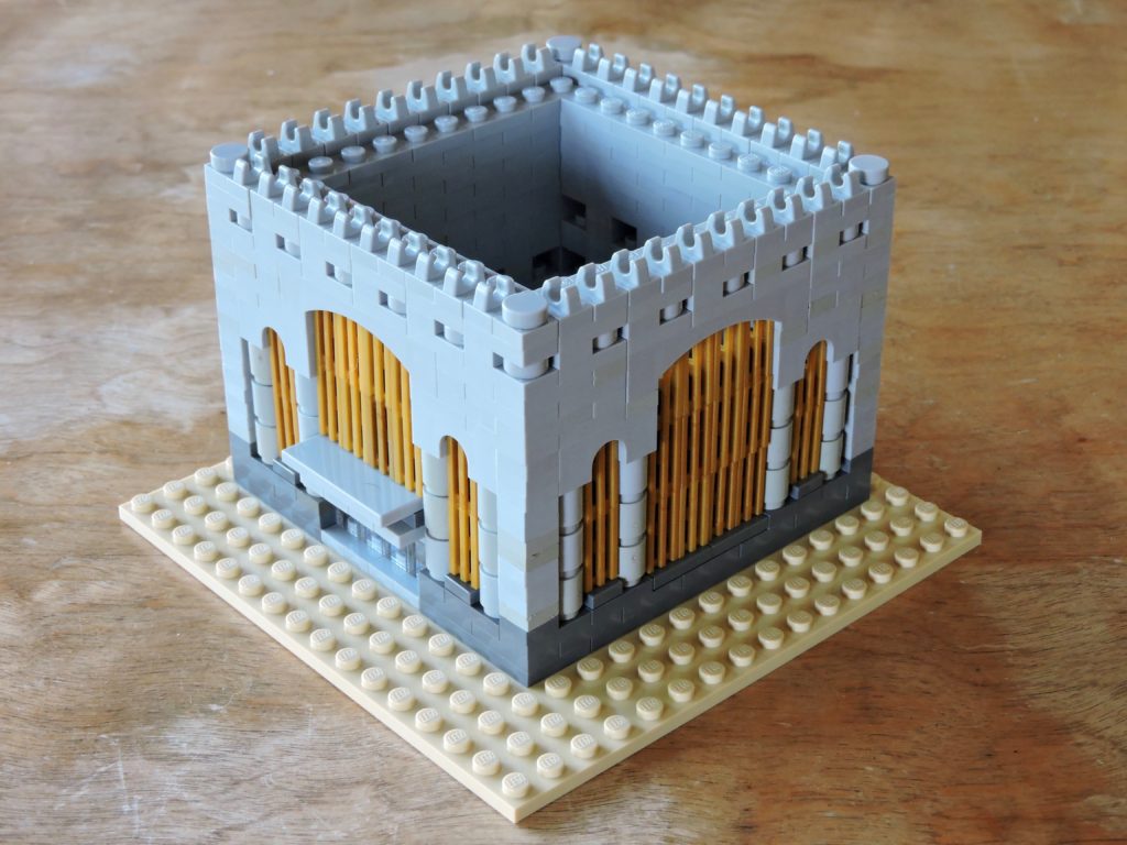
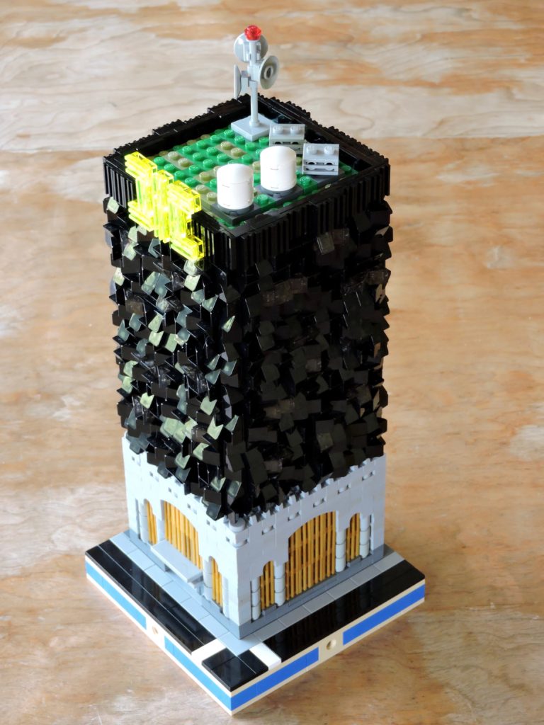
This time I made the bottom dark gray and used light gray above that. I widened the footprint, which meant swapping out the arches. The light gray gave me the ability to mix up the elements a bit and add a bit more texture. The windows use some simple snot techniques to slip the pearl gold grating up into the arches.
From the back side, you can see the some of the bracing for the windows. The back wall is entirely plate built. I’ve used mostly 2×2 plate, since that makes the wall more stable. If I’d used 1×2 plate, it would have looked roughly the same from the outside, but the wall would have tended to wobble slightly.
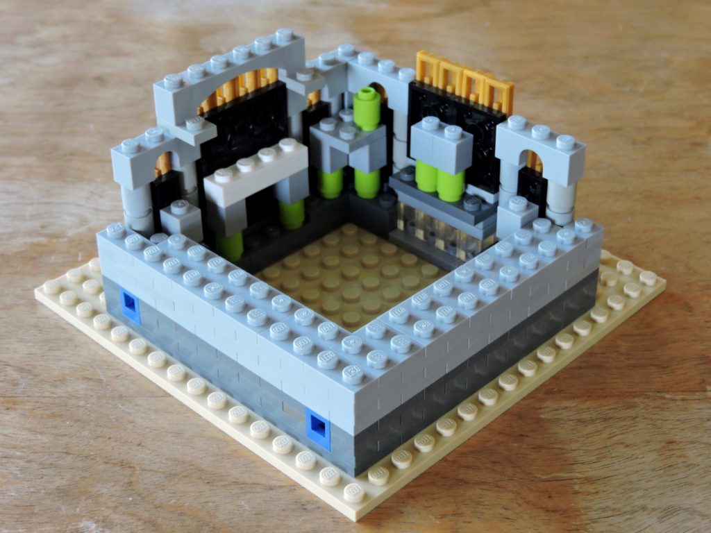
I’ve tucked a pair of emergency doors opposite the entrance, facing what will become an alley.
It doesn’t take much more to finish out the masonry portion of this building. A little extra texture near the top and then some clips to give a nice crenelation and I have an old bank.
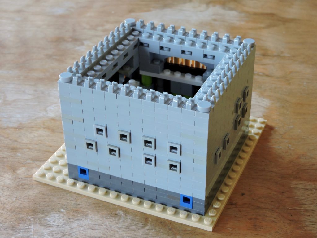
I’ve added a few smaller windows along the back sides, overlooking the alleys. I’m assuming that there are about four high-ceiling floors in this part of the building.
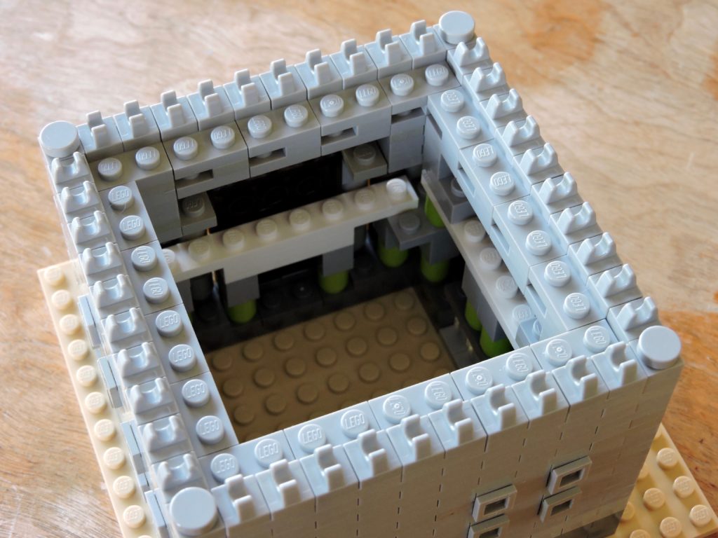
Inside, you can see that I’ve braced the windows to keep them from being easily pushed in. I’d like to avoid having to disassemble the building to fix them.
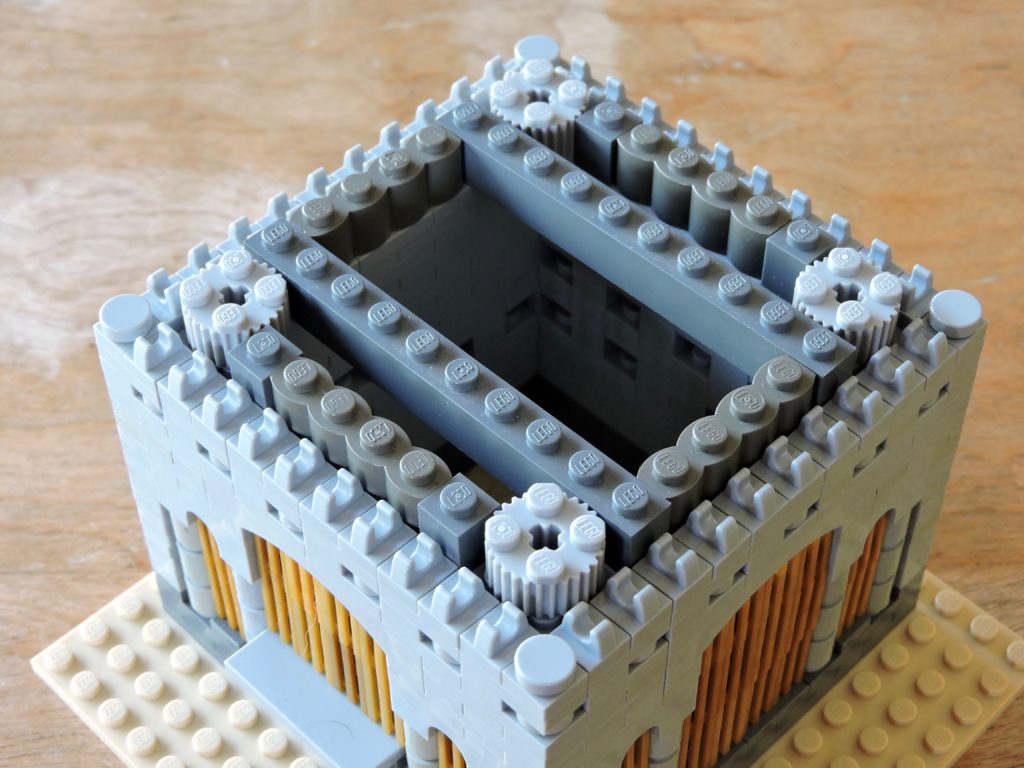
The next part of my model is to attach a massive modern extension to the building. My story is that the building had been gutted down to the masonry and then had a new building built out of the top. Here I’ve added a little structure (and bracing) so that I can attach the upper shell. The various textured bricks won’t be very visible, but the little details are the whole point.
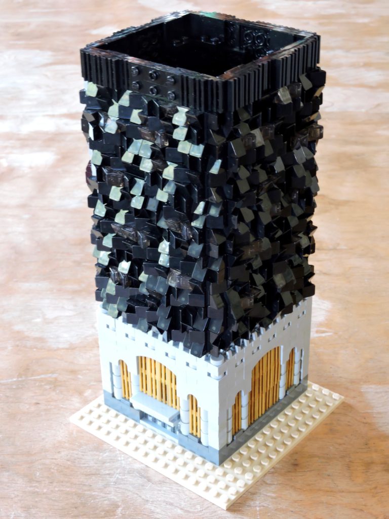
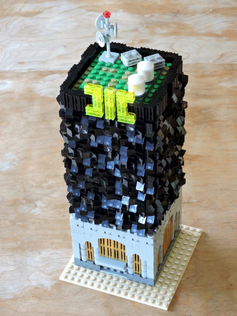
Then I added ten floors of post-modernism. I’m picturing a skin of articulated carbon fiber and glass panels. This took a little patience to build, using a clever snot bracket technique to create the studs-out square, then a pattern of plates to add depth, before covering every stud with a cheese slope. I didn’t have enough translucent black, so I had to ration them out and then fill the majority of the space with black. By positioning them pseudo-randomly (consciously avoiding repetitious patterns), I managed a lovely texture.
The more I do this kind of organic texturing, the more I believe that pacing is the key. If I try to do too much at once, it is easy to fall into patterns and ruin the desired chaos. Breaks also allow time for fingertips to recover.
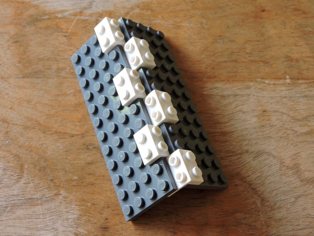
This is the technique I used to create the basic structure. I made each corner as a separate piece and tacked them together with other plates on the back. Between these and the plates I added on the outside, the result was sturdy. I’m looking forward to using this technique more in the future.
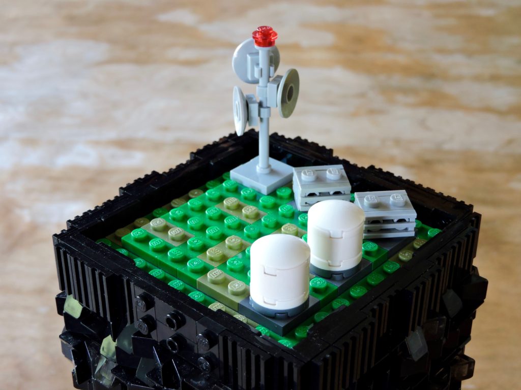
I hung the roof on more brackets. I added a mix of industrial details, a pair of water tanks (inverted with round jumpers and washer tiles), some big HVAC units and a communications mast. That little translucent red at the top catches light nicely and works great as a warning beacon. I honestly don’t know how tall a building needs to be before it has the have a beacon, but it felt right.
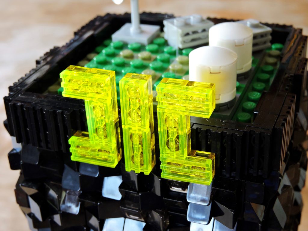
The icing on this vanity architecture cake had to be an oversized glowing corporate logo. I used a layer of translucent neon green grills, backed with translucent yellow plates. Mounted on the black, it is practically luminescent. Perfect for Consolidated Industrial Composites.
There is a lovely dissonance between the two sections, a contrast of traditional and post-modern. I can already imagine the building having a terrible nickname like all the eyesores in London: the Beefeater.
No real landscaping on this module, just roads, sidewalk, and alleys. The requisite blue to denote zoning and I have another lovely addition to my Micropolis.
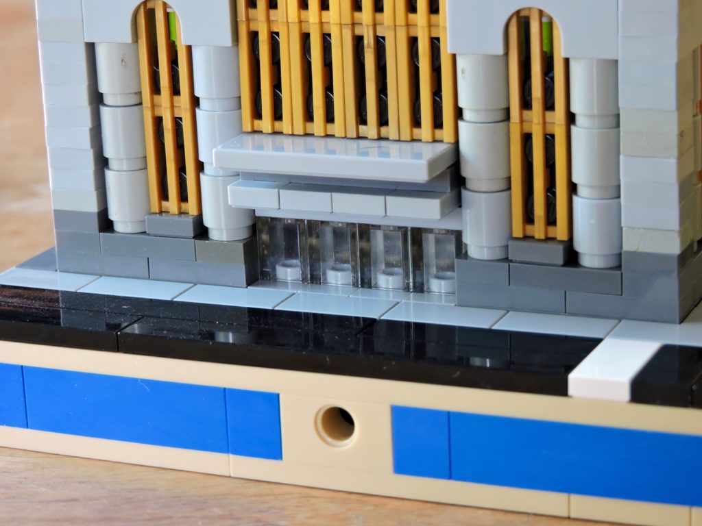
I’ll leave you with a shot of the entrance. This is one of the small details that I really like on this building, a span of glass doors below a multi-tiered covering.
Keep building and enjoy!